We live in an age of image-centered content. The written word is losing its significance and being replaced by illustrations that put information in an easy-to-understand format. Content with relevant images gets 94% more views than content without images (source: Kissmetrics). Even something as simple as putting a relevant photo or two in your blog posts increases engagement with your audience. Don’t entirely discount the importance of the written word – well-crafted and easy to read content goes a long way. Pair the two together, and you have a content marketing powerhouse.
Infographics
Infographics have been around in many forms for thousands of years, effectively communicating important information in a visual manner. From graphs and pie charts in Excel to infographics explaining complicated information, visual arrangement of facts and directions is shown to be 323% more effective than text alone*. Look complicated? Not at all. There are many sites on the internet with resources to make your own infographics; try www.visme.co.
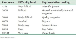
Flesch Reading Ease Scale

*Levie, W. Howard and Richard Lentz. “Effects of text illustration: A review of research” ECTJ vol. 30 (1982): pp195-232.

