When prospective clients search for a personal injury attorney, a law firm’s website often becomes their first point of contact. It needs to establish trust quickly, explain complex services clearly, work smoothly on every device, and make it easy for someone to ask for help.
Our website redesign for Reservitz Law Group shows how those goals can come together in a modern, accessible WordPress website. The firm represents injured clients throughout Massachusetts in cases involving auto accidents, pedestrian accidents, truck accidents, motorcycle accidents, slip and falls, dog bites, workplace injuries, medical malpractice, and other personal injury matters.
This was the second website we built for the client, following work for another one of their law firms. That existing relationship gave us a strong understanding of the client’s expectations, audiences, and approach to legal service. For Reservitz Law Group, we transformed an older HTML website into a flexible WordPress platform built to better showcase the practice, support search visibility, and help prospective clients connect with the firm.
For firms researching small law firm website design examples, this project demonstrates an important principle: an effective legal website does more than look professional. Every part of the experience—from the attorney photography to the language selector and location pages—should help a potential client decide what to do next.
Project Overview
Reservitz Law Group needed a website that reflected the quality of its legal services while remaining approachable to people who may be dealing with an injury, financial pressure, or uncertainty about their rights.
The original website was built in static HTML. While that format can serve a basic purpose, it made ongoing content development and expansion more difficult. As a Boston website design company, we rebuilt Reservitz Law Group’s outdated HTML website into a modern WordPress platform designed to serve personal injury clients across Greater Boston and Massachusetts.
The project centered on several goals:
- Present Reservitz Law Group as an experienced, trusted personal injury firm.
- Introduce the lead attorney prominently and create a more personal first impression.
- Make calls, texts, consultation requests, and office information easy to find.
- Serve a multilingual client base in English, Haitian Creole, Portuguese, and Spanish.
- Explain the firm’s practice areas and legal process in straightforward language.
- Highlight representative results, testimonials, professional recognition, and differentiators.
- Build a mobile-friendly, accessible foundation for ongoing SEO and content growth.
- Develop community-focused location pages for the areas the firm serves.
The finished site balances credibility with clarity. Visitors can understand who the firm helps, why they might choose it, and how to start a conversation without having to search through dense navigation or legal jargon.
What We Did
Rebuilt the website from HTML to WordPress
We replaced the firm’s old HTML website with a custom WordPress build. This gave the client a more manageable publishing platform and created a stronger foundation for adding practice-area content, community pages, attorney information, testimonials, and future resources.
The new structure also allowed us to use consistent page templates. That consistency matters on a law firm website: visitors should not have to relearn the interface as they move from an auto accident page to a pedestrian accident page or from the attorney biography to a community page.
Created a conversion-focused homepage
The homepage was designed to answer a prospective client’s most immediate questions:
- Does this firm handle my type of case?
- Who will I be working with?
- Why should I trust this attorney?
- Has the firm achieved meaningful results?
- What happens after I contact the office?
- How can I call, text, or request a consultation?
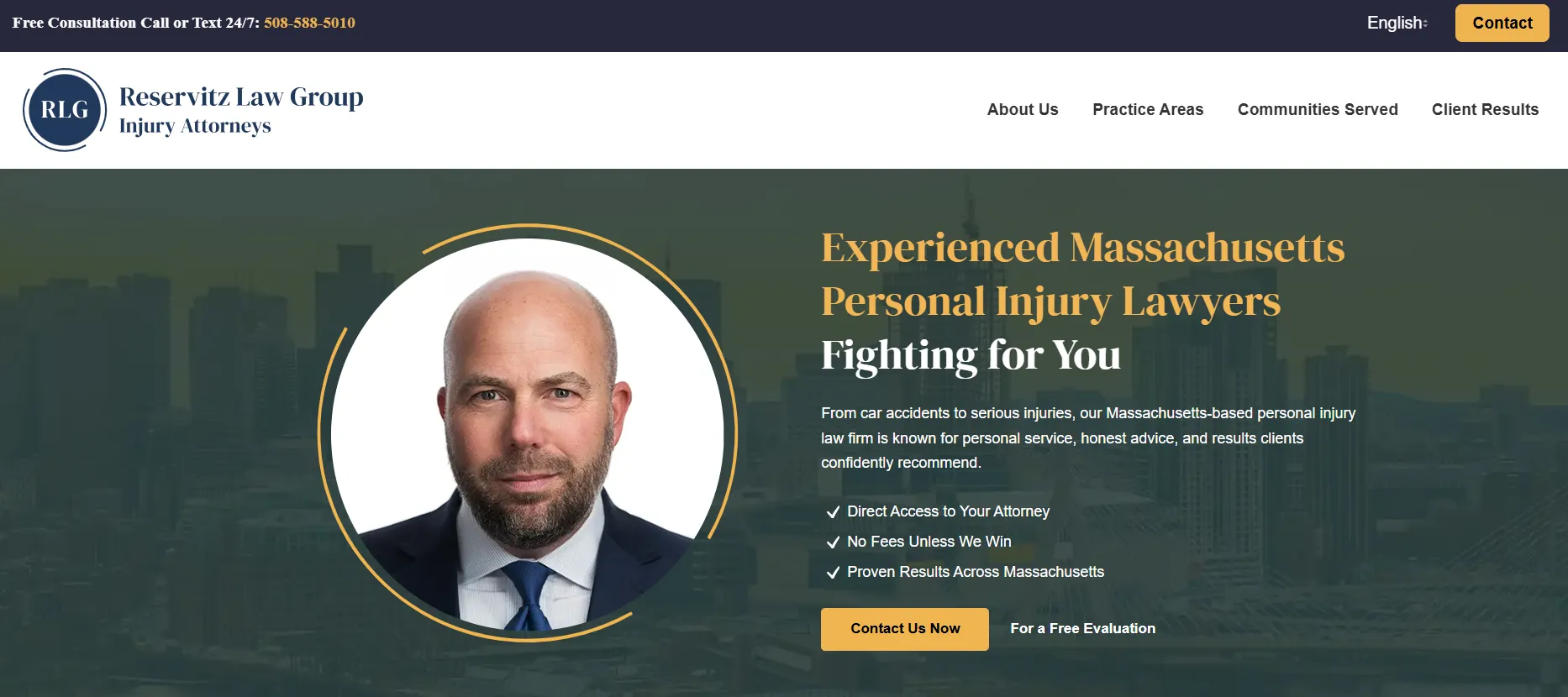
At the top of the page, we placed prominent options to request a free consultation or text the firm 24/7. A highlighted contact button and visible phone number keep the next step clear.
We also featured a professional headshot of the lead attorney in the hero area. Small firms can have an advantage here: clients often value knowing who will handle their matter. Showing the attorney immediately makes the experience more personal and reinforces the firm’s promise of direct access.
Concise value statements communicate the core reasons to choose the firm, including direct attorney access, no fees unless the client wins, and proven results across Massachusetts.
Made the website multilingual
Reservitz Law Group wanted to communicate with more of the communities it serves. We added a clear language switcher so visitors can view the website in English, Haitian Creole, Portuguese, or Spanish.
For a community-oriented practice, multilingual access is more than an optional enhancement. It can reduce friction, make important information easier to understand, and help visitors feel that the firm is prepared to serve them. The language selector is therefore part of the primary user experience rather than being hidden in the footer.
Showcased credibility and professional recognition
Legal consumers look for signals that a firm is established and capable. We created a trust section displaying the recognitions and affiliations provided by the firm, including Super Lawyers, the Plymouth County Bar Association, The National Trial Lawyers Top 100, and BBB accreditation.
These credibility markers support—not replace—the website’s substantive content. Paired with the attorney profile, client testimonials, representative results, and detailed practice-area pages, they help create a fuller picture of the firm.

Highlighted representative case results
Results were presented prominently to show the scale and variety of matters the firm has handled. Examples supplied for the website included:
- $3 million for an auto accident matter
- $2.25 million for a motorcycle accident matter
- $1.75 million for an auto accident matter
- $775,000 for a workplace injury matter
On a legal website, results should be easy to scan and presented with appropriate context and disclaimers. The goal is to demonstrate experience without implying that a past outcome guarantees a future result.
Organized practice areas visually
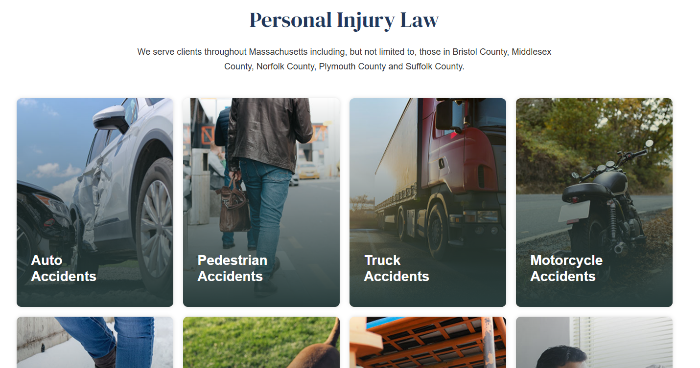
Personal injury firms may handle many different types of claims, and a long text list can be difficult to absorb. We used visual practice-area navigation to help visitors quickly identify the service relevant to them.
The site covers auto accidents, pedestrian accidents, truck accidents, motorcycle accidents, slip and falls, dog bites, workplace injuries, medical malpractice, and additional personal injury matters. Each core area leads to its own focused page rather than competing for space on a single generic services page.
Explained the client journey
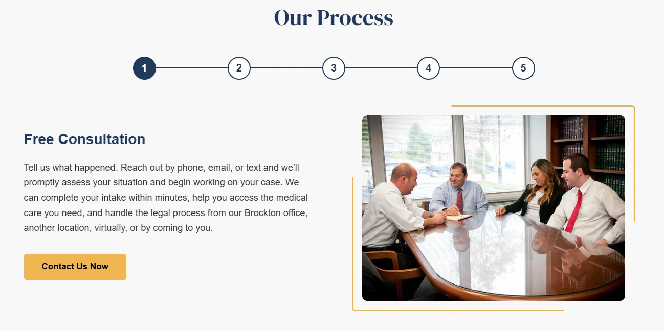
People contacting an injury lawyer may have never worked with an attorney before. To make the experience feel more predictable, the homepage includes a clear process section covering five broad stages:
- Free consultation
- Strategic case planning
- Active representation
- Settlement demand and negotiation
- Resolution
This section turns an unfamiliar legal process into a sequence that visitors can understand. It also gives the firm an opportunity to show that client communication and deliberate strategy are part of its service.
Developed strong “Why Choose Us” messaging
The website brings the firm’s key differentiators into one focused section: Massachusetts personal injury experience, a proven track record, and exceptional client care.
These points are most effective when supported throughout the site. Attorney information supports the promise of experience. Results support the record of performance. Testimonials support the claim of attentive service. Together, they make the message more credible than broad marketing language alone.
Built detailed practice-area page templates
Each major practice area received a repeatable, content-rich template. Pages combine an overview, relevant trust signals, representative results, detailed accident or injury scenarios, practical next steps, frequently asked questions, and a clear consultation prompt.
For example, the pedestrian accident content can address crosswalk collisions, hit-and-run crashes, sidewalk and mid-block incidents, school-zone accidents, and impaired drivers. It can also explain what to do after an accident and answer questions such as what a case may be worth or what legal options may be available.
This approach serves two audiences at once. Prospective clients receive genuinely useful information, while search engines gain clearer signals about the subject and purpose of each page.
Created service-area pages for local SEO
We worked with the firm on SEO services and expanded the site with community-focused pages for Boston, Brockton, Bridgewater, East Bridgewater, and other relevant locations.
A strong local page should be useful to someone in that community, not simply repeat a city name throughout generic copy. The broader site architecture gives these pages room to connect local context with the firm’s services, locations, contact information, and related practice areas.
Made every contact path easy to find
The website includes several ways to take action: call, text 24/7, request a free consultation, or submit a contact form. At the bottom of the homepage, a prominent form gives visitors a final opportunity to reach out after reviewing the firm’s services and credentials.
The firm’s three office locations are also clearly displayed so visitors can identify the most relevant location and phone number. This combination of persistent calls to action and complete office details helps the site serve users with different preferences.
Designed for mobile use, accessibility, and readability
The visual system uses blue and green accents, generous white space, readable typography, and modern page layouts. Information is broken into clear sections so visitors can scan the site without losing the larger story.
Mobile usability was especially important. Someone looking for an injury attorney may be using a phone immediately after an incident or while away from a desktop computer. Calls, texts, menus, forms, and language options therefore need to remain easy to use on smaller screens.
Accessibility was also considered as part of the rebuild, helping the content reach more users and supporting a more inclusive experience.
Example Sitemap for a Small Law Firm Website
The Reservitz Law Group project provides a useful starting point for other personal injury practices. A sitemap based on this model might include:
- Home
- About the Firm
- Attorney biography
- Firm approach
- Professional recognition
- Practice Areas
- Auto accidents
- Pedestrian accidents
- Truck accidents
- Motorcycle accidents
- Slip and fall injuries
- Dog bites
- Workplace injuries
- Medical malpractice
- Other practice areas
- Results
- Client Testimonials
- Communities Served
- Boston
- Brockton
- Bridgewater
- East Bridgewater
- Additional service areas
- Frequently Asked Questions
- Blog or Legal Resources
- Contact
- Language Versions
- English
- Haitian Creole
- Portuguese
- Spanish
Not every small firm needs the same number of pages at launch. The important part is choosing an architecture that can grow without making navigation confusing.
Example Homepage Wireframe for a Law Firm Website
A homepage inspired by this project could follow this order:
- Utility bar: Phone number, 24/7 text option, language selector, and free-consultation link.
- Main navigation: Logo, practice areas, about, results, communities served, and contact button.
- Hero section: Attorney portrait, concise positioning statement, primary phone or consultation action, and three key differentiators.
- Trust signals: Selected affiliations, awards, accreditations, or media recognition.
- Representative results: A short row of significant outcomes with a link to view more.
- Practice areas: Visual cards for the firm’s most important services.
- Attorney introduction: A short personal message and link to the full biography.
- Languages and communities served: A clear explanation of whom and where the firm serves.
- How the process works: A simple step-by-step overview from consultation to resolution.
- Why choose the firm: Evidence-backed differentiators such as experience, access, care, and results.
- Client testimonials: Selected reviews with a link to the complete testimonials page.
- Consultation form: A concise form paired with phone and text options.
- Office locations: Addresses, individual phone details, directions, and hours where relevant.
- Footer: Full navigation, required legal notices, social links, accessibility information, and language access.
This wireframe creates a deliberate progression: establish relevance, build confidence, explain services, reduce uncertainty, and invite contact.
Key Features for Law Firm Websites
The most useful small law firm website design examples tend to share a core set of features:
Clear calls to action
Visitors should never have to hunt for a phone number or contact form. Use a small number of consistent actions—such as “Request a Free Consultation,” “Call Now,” and “Text 24/7”—throughout the site.
Prominent attorney profiles
For small firms, the attorney is often the brand. Professional photography and a well-written biography help communicate personality, experience, and the nature of the client relationship.
Individual practice-area pages
Dedicated pages give each service enough room for useful explanations, questions, next steps, and relevant proof. They are better for users and provide a stronger base for organic search than one broad services page.
Results and testimonials
Representative outcomes demonstrate experience, while client stories reveal what it feels like to work with the firm. Both should be accurate, appropriately qualified, and compliant with the professional rules that apply to the firm.
Multilingual access
If the practice serves multilingual communities, language options should be visible and easy to use. Professionally reviewed translations are preferable for legal content, where nuance matters.
Local information
Accurate office details and helpful service-area pages support both visitors and local search visibility. Keep names, addresses, and phone numbers consistent across the website and the firm’s online profiles.
Accessible, mobile-friendly performance
A law firm website should work with keyboards and assistive technologies, maintain readable contrast, label forms clearly, use meaningful headings, and remain usable at different screen sizes. Fast loading and restrained use of animation also help visitors stay focused.
A manageable content platform
A well-built WordPress site can give a small firm the flexibility to add attorneys, results, articles, FAQs, and locations without rebuilding the entire website each time the practice grows.
Design Suggestions for Small Law Firm Websites
Start with trust, not decoration. A modern site can still feel serious and established when it uses authentic attorney photography, disciplined typography, clear hierarchy, and evidence-backed messaging.
Use color strategically. Deep blues often communicate confidence, while green can add warmth and forward movement. Neutral backgrounds and ample white space keep long legal pages readable. Whatever palette a firm chooses, sufficient contrast is essential.
Keep the navigation focused. Practice areas, attorneys, results, locations, resources, and contact information usually deserve priority. Avoid overwhelming the main menu with every possible page.
Write for people under pressure. Use plain-language headings, short paragraphs, descriptive buttons, and direct answers. Legal accuracy matters, but dense legal terminology should not stand between a visitor and the information they need.
Connect visual design to conversion. A beautiful hero image is only useful if the visitor can also identify the firm, understand its services, and take the next step. Every major section should have a clear role in the decision journey.
Finally, plan for compliance from the beginning. Attorney advertising rules, privacy disclosures, accessibility expectations, testimonial language, and results disclaimers should be reviewed for the firm’s jurisdiction. Design and compliance work best when treated as part of the same system.
A Practical Model for Small Law Firm Website Design
The Reservitz Law Group website is a strong example of how a small law firm can combine a personal brand with the depth of a larger legal website. The lead attorney remains visible, the value proposition is direct, and the site provides substantial information without losing the path to contact.
For another firm planning a redesign, our recommendations are straightforward:
- Lead with the attorney and the people behind the practice.
- Make the primary services obvious within seconds.
- Offer calls to action that work for different communication preferences.
- Use results, testimonials, and recognition as supporting evidence.
- Give every important practice area a genuinely helpful page.
- Build location content around real community relevance.
- Make multilingual access prominent when it reflects the audience.
- Design for mobile visitors, accessibility, speed, and future growth.
- Review all claims and legal marketing content under the applicable professional rules.
A successful law firm website should feel like the beginning of a good client relationship: clear, reassuring, responsive, and focused on what the visitor needs.
Continue Exploring Law Firm Website Strategy
Planning a new legal website or improving an existing one? The following resources can help you evaluate your next steps:
- 6 Important Things to Consider When Building Your New Law Firm Website
- How to Create a Captivating Homepage for Your Law Office Website
- Small Law Firm Website Design Best Practices
- Our Favorite Law Firm Website Examples
Explore More Law Firm Website & Digital Marketing Resources
A modern law firm website can play an important role in building credibility, improving the user experience, and supporting your broader digital marketing strategy. Explore our Law Firm Website & Digital Marketing Resources for more insights on website design, SEO, digital marketing, and creating a stronger online presence for your firm.


