The homepage of your law office website is likely the first page a user will see. This means that users will develop their first impression of your firm based on that page, so you have only seconds to captivate them.
At Compete Now, we know how to captivate a user with a website because we’ve worked in this industry for over a decade and designed over 200 websites. Our work with legal web design focuses on uplifting your firm’s message, showcasing your professionalism, and gaining trust with interested users to encourage them to reach out. Give us a call today to find out how we can do that for your firm.
In the meantime, learn about the elements of creating a captivating homepage for your law office website below.
Purposeful Headline
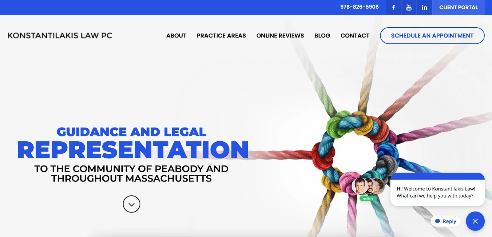
Your headline is the first thing visitors see when they land on your homepage. It should be clear, and concise, and convey the primary value or service your law firm offers. A purposeful headline grabs attention and immediately communicates what your firm specializes in. For example, Konstantilakis Law’s website does that perfectly above. The bright blue of their headline against the gray banner grabs your attention immediately and informs you of what they do. Now, users will know within seconds if Konstantilakis services their area.
Include a High-Quality Image of the Firm
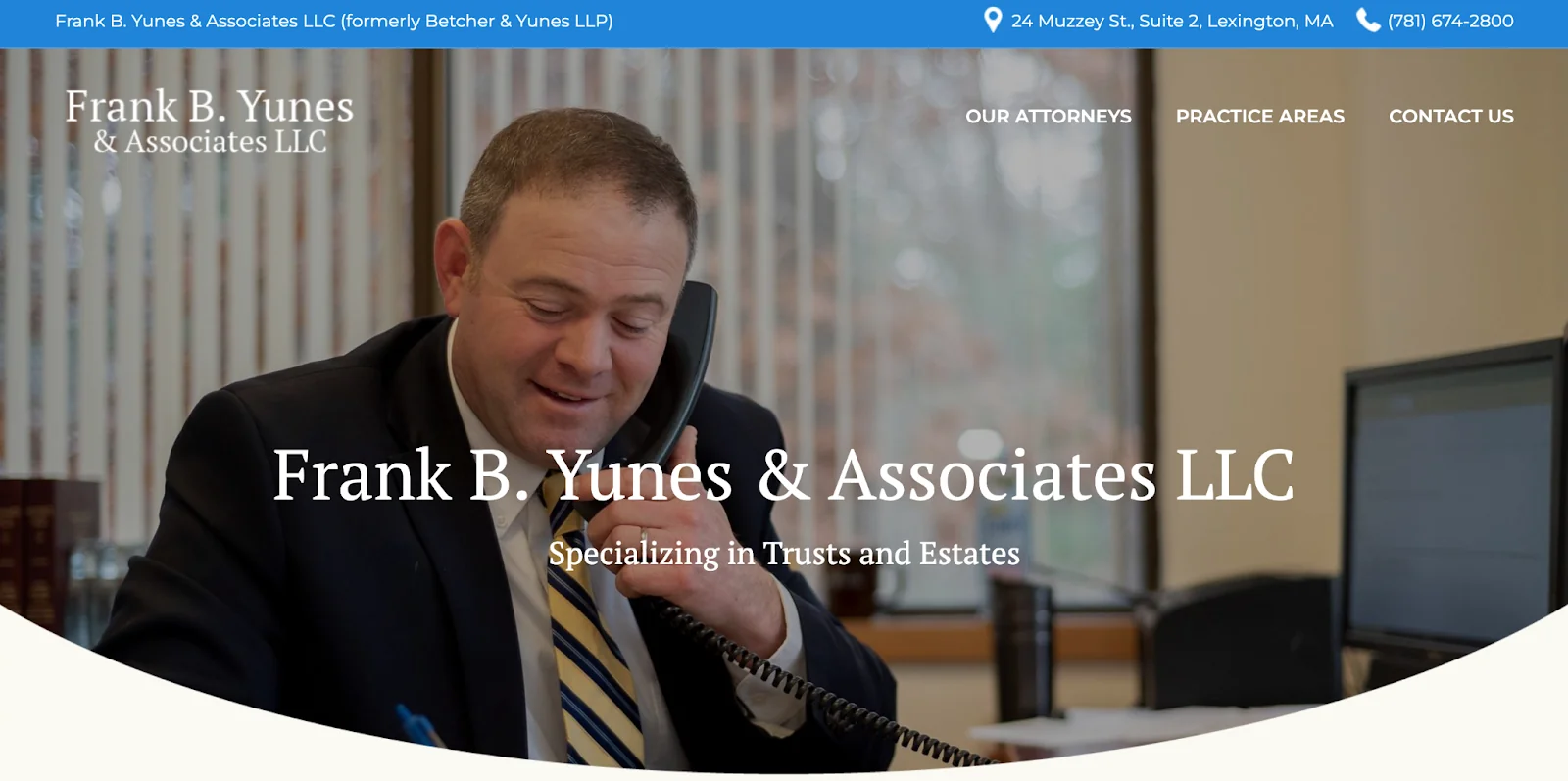
Visual elements play a significant role in creating a captivating homepage. Including a high-quality image of your firm or team adds a personal touch and builds trust with potential clients. Make sure the image is professional and reflects the values and atmosphere of your law office. For example, we included this image of Frank B. Yunes of Yunes Law in his office on the phone, above. This image provides users with an idea of the staff at Yunes Law, showcasing that they’re kind and attentive people when handling your case. A welcoming and professional photograph can make your firm seem more approachable and trustworthy.
Add Calls to Action
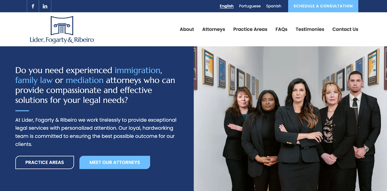
Something important to consider when building your new law firm website is including calls to action (CTAs). CTAs guide visitors towards taking specific actions, such as contacting your firm, scheduling a consultation, or downloading a resource. Place prominent and compelling CTAs throughout your homepage to encourage visitor engagement. On Lider, Fogarty & Ribeiro’s homepage above, there are three CTAs you’ll notice right away: “Schedule a Consultation,” “Practice Areas,” and “Meet Our Attorneys.” These buttons draw your eye to the pages the law firm wants you to visit. You can also include phrases like “Contact Us Today” or “Get Your Legal Questions Answered” to motivate visitors to take the next step to becoming a client.
Utilize Brand Colors
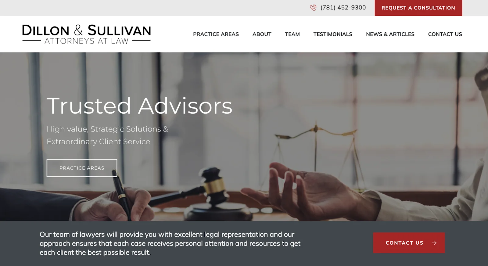
Consistent use of brand colors helps reinforce your law firm’s identity and creates a cohesive look for your website. You want to apply these colors strategically across your homepage on elements such as buttons for CTAs or the main menu. For Dillon & Sullivan’s homepage, we added their burgundy red to their CTA buttons to attract the eye to those pages. This consistent color usage throughout the website also makes it more visually appealing and professional.
Minimize Dense Text

Our favorite law firm website examples include content that provide quick and easy-to-digest information. Minimize dense text and break up content with headings, bullet points, and short paragraphs. Focus on providing essential information in a concise manner. Use plain language to ensure that all visitors, regardless of their legal knowledge, can understand your services and offerings. We implemented this while developing Konstantilakis Law’s homepage above by creating three elements that focused on their practice areas, rather than just filling the space with three paragraphs of dense text. If visitors want to learn more, they can click on the box to read about the practice area.
Develop an Easy-to-Navigate Main Menu
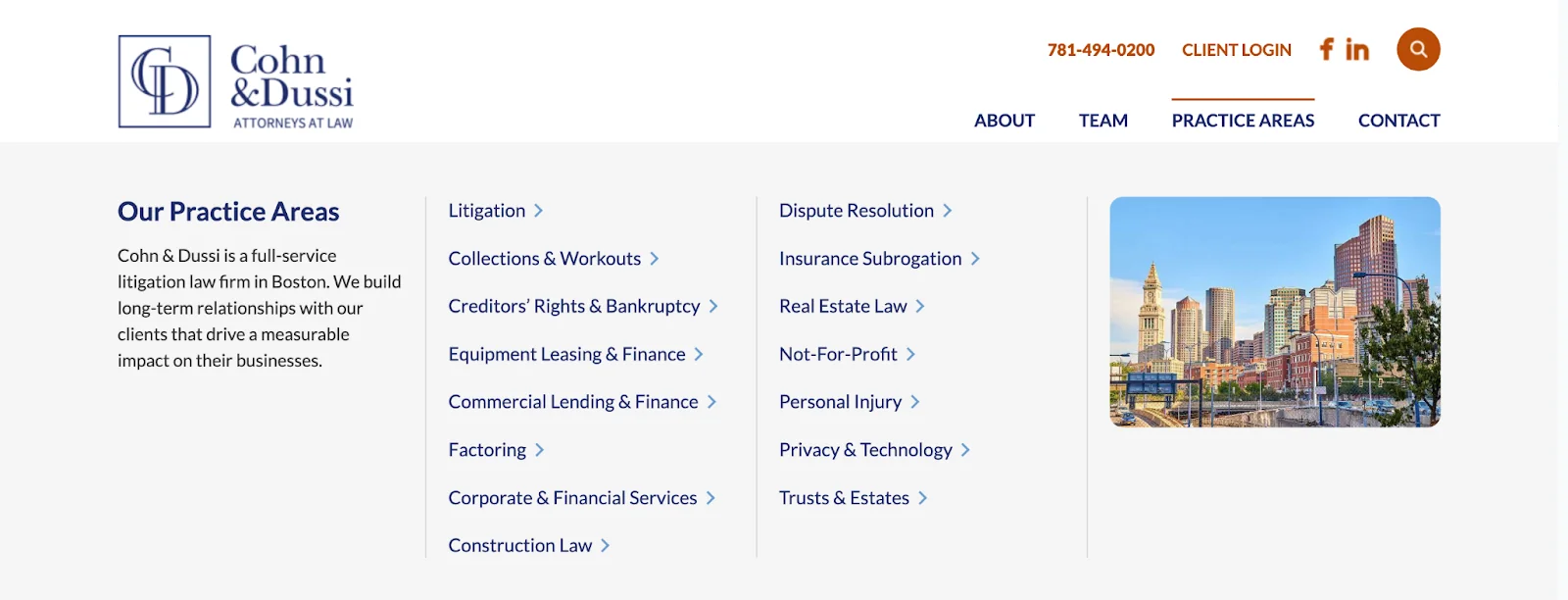
An intuitive and easy-to-navigate main menu is crucial for helping visitors find the information they need quickly without leaving your website because they can’t find it. Organize your main menu with clear, descriptive labels for each section. Include links to essential pages such as “About,” “Practice Areas,” “Team,” “Contact,” and any other relevant sections, such as Cohn & Dussi does, accompanied by their dropdown menus to keep it organized. A well-structured menu enhances user experience and reduces frustration, making it more likely that visitors will explore your site further.
Book with Compete Now to Design Your Homepage
Creating a captivating homepage requires a combination of elements and eye-catching, relevant keywords. However, it can be difficult to figure out how your firm fits into that set of guidelines. Let us help by scheduling a meeting with us today. We’d love to hear more about what you want in a law office website.

