Social media platforms like TikTok only have three seconds to grab a user’s attention. It’s proof that people want their information quick, concise, and informative, especially when they’re scrolling through websites looking for answers to their questions. Making your website’s design and layout easier to read is vital for a positive online user experience.
Navigation is critical to keeping potential customers on your site, so if your website’s navigation is not up to par, it could hurt your business. Below, we’ll discuss the best practices and tips for how to make your website easier to read!
Keep Your Character Count to 80 per line
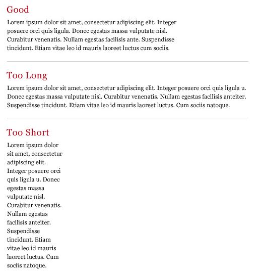
Keeping visitors interested in your content and website, can be a challenge, but it’s an essential part of making your site the best website possible. When you keep the length of each line to around 50-80 characters, it keeps visitors engaged due to the fact that lines any longer than 80 characters are seen as subconsciously intimidating. It also helps solve a common online dilemma of visitors’ attention span lasting only 7 seconds. With shorter lines, comes more consistency in visitors reading what is on your site.
Use an Abundant Amount of White Space
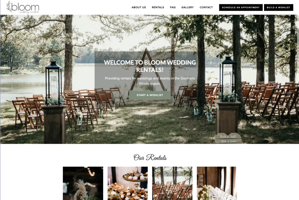
Similar to keeping lines of text concise for approachability, your homepage should do the same. This can be done by utilizing as much white space as possible on your homepage to keep users from getting bombarded with too much information, as we did for a client, Bloom Wedding Rentals above. Only showcase the necessary elements of your business in order to make its purpose and usability evident. The main takeaway: ample white space with an effective call to action and a few icons/images.
Don’t Use 12pt Font!

Surprisingly, size 12pt font is extremely inefficient for websites! The quote above is from web design usability expert Oliver Reichenstein who says the ideal size of your website’s font should be 16pt for the lengthier paragraph portions of your site.
Regarding the actual font itself, there are two font families – Serif and Sans Serif. Serif is the family which consists of fancier-looking fonts such as Times New Roman. Sans Serif is the family of more rounded fonts, such as Arial, which are actually the more effective of the web fonts.
But don’t select too many fonts! Use a maximum of three fonts throughout the entirety of your site to maintain easy readability and aesthetic harmony.
Add Images
Breaking up the text in your web pages is important in order to keep readers engaged, because not only does a web page full of text look intimidating, but it’s harder for our brains to process. Including images that are relevant to the content and your business will make information more digestible.
Contrast is Crucial for Your Website
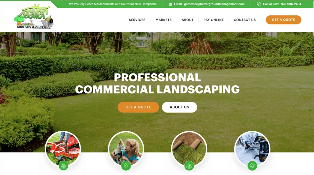
It is integral that your website’s fonts contrast with the website’s background, or else no one will be able to read it! You should select colors that are representative of your overall brand identity. Just make sure you don’t get too creative and sacrifice readability for your web design. For example, we added a hint of green throughout our web design for Better Grounds Management above.
Navigability Helps Readability – Quick Tips!
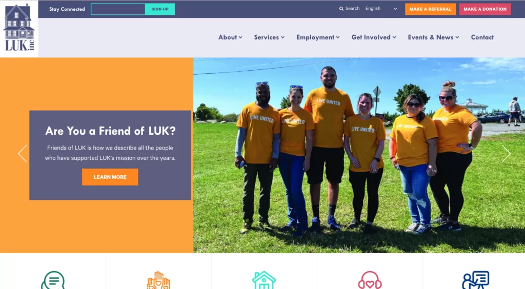
- Link your logo to your homepage and put it at the top of your site, as we designed for LUK above.
- The menu should be at the top of your website and structured by importance.
- Keep it vertically navigable so that users can scroll through it (scrolling is as commonplace as breathing nowadays).
- Use a footer to put all your most important links at the bottom of your website.
- Keep your most important content at the top, that way your visitors don’t need to scroll too far to understand what your business is all about.
Organize Content-Heavy Pages into Tabs & Accordions
Tabs
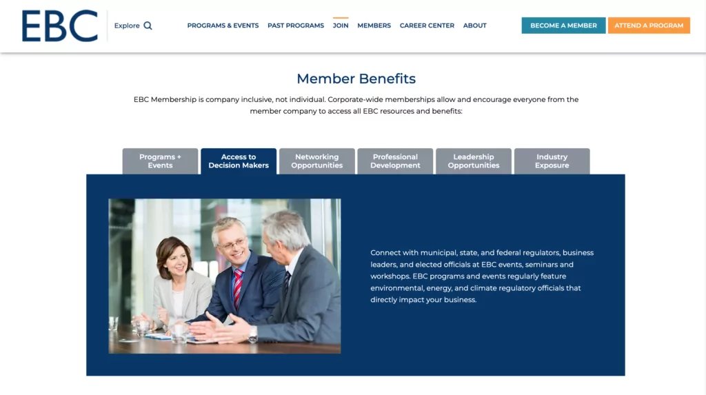
If you are funneling a lot of content into your web pages, consider organizing them into tabs and accordions to refrain from overwhelming your visitors. This is useful for pages that can be broken up into smaller sections, while still offering the abundance of valuable information you wrote. An example of tabs being used to make content easier to read can be found on the EBCNE website. It consists of horizontal tabs that open up to snapshots of information.
Accordions
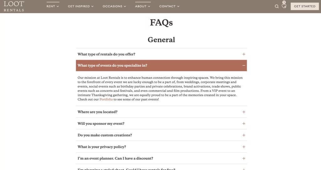
Accordions offer the same solution of breaking up text, but they have a slightly different look from tabs. While tabs are horizontal, as seen above, accordions drop down in a vertical manner with prompts stacked on top of one another. This is popular on FAQs pages, as seen on the Loot Rentals website below.
Making Your Website Accessible
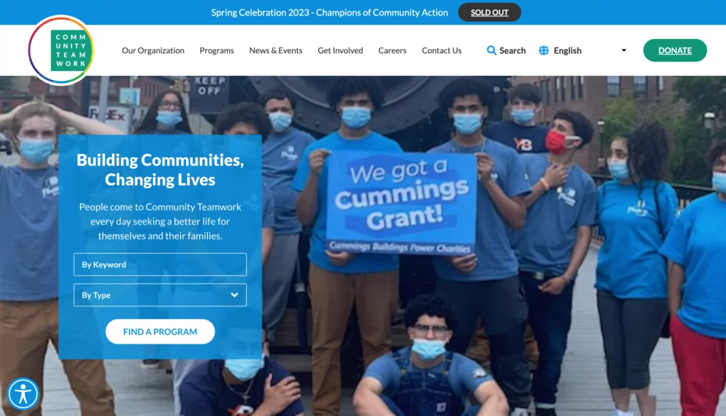
Aspects of your website like contrasting colors are important because it makes your site easy to read. However, that is only one step to making your website accessible to all visitors. We highly recommend adding an accessibility widget such as Userway to your website that allows users to control the font sizes, colors, and other features based on their needs. The example above of Community Teamwork showcases how the widget appears in the bottom left corner.
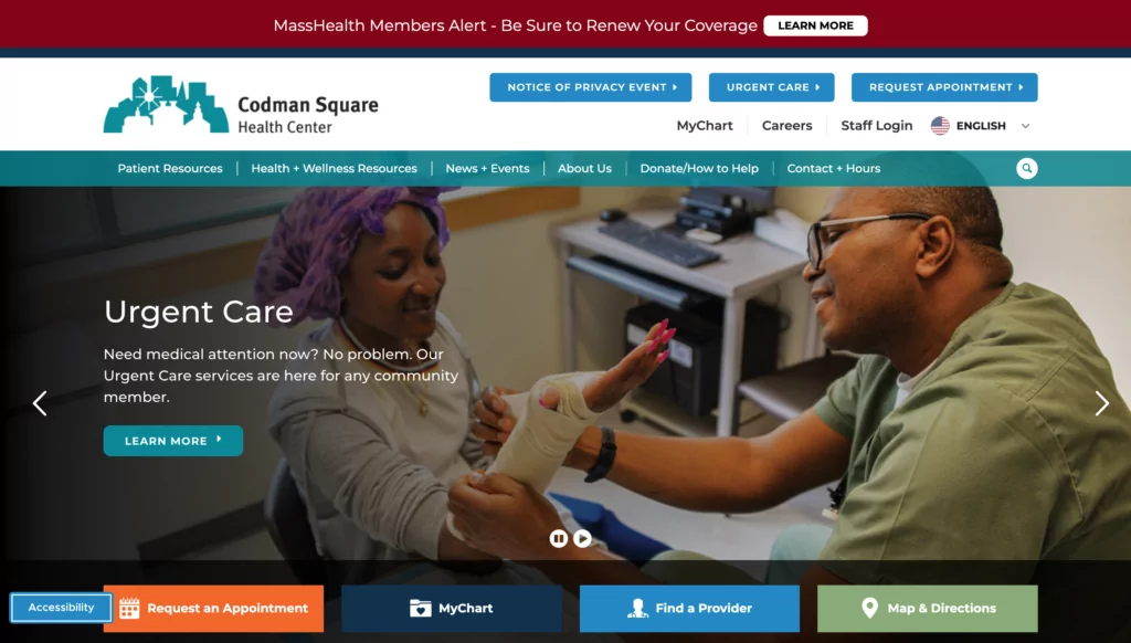
On Codman Square’s website, they also utilize the Userway accessibility widget, with the button appearing slightly different. However, it still serves the same purpose, allowing visitors to hide images, increase text size, and much more, for a comfortable user experience.
Take Advantage of Lists & Bullet Points

If you’re struggling to structure your content in order to make it easy to read, but specifically to scan quickly, then lists and bullet points are your friends! Use relevant keywords in the lists to give your website’s visitors a lot more information than a lengthy paragraph could. Additionally, couple the text with images so they can get a visual representation of what they are reading.
Use Sub-Headlines
Similar to utilizing lists for those who scan through webpages (which is 79% of people), sub-headlines are just as important! Sub-headlines help break up lengthy pages and articles by labeling the content every two paragraphs or so. That way you’re not making the reader do the work to find out what certain paragraphs are talking about.
Looking to Redesign Your Website? Contact Us for a Quote
Get StartedContact Us for Professional Help!
If you’re worried about the readability of your site, contact us! We can look at your site from both the eyes of a potential customer and a professional. Call us at 617-539-6528 or shoot us an email at info@competenow.biz!

