
For non-profits, a donation page will be a primary source of donations. You want your donors to understand who they’re donating to, and why they should share it with others. But creating your donation page can become overwhelming. That’s why we’re sharing our most effective donation page examples for non-profits. Would you like help designing your website’s donation page? Call us and we’ll do it for you!
Looking to Redesign Your Website? Contact Us for a Quote
Get StartedHow to Make An Effective Non-Profit Donation Page
Show Visitors Ways That They Can Donate
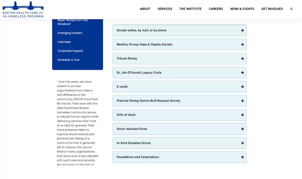
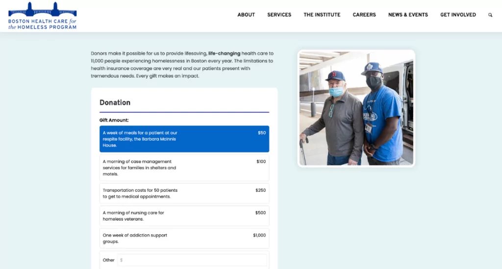
An effective way of creating a donation page is to make it informative. Fill your donation page with information on every way visitors can give. This can include how to donate online, by phone, or by mail. As well as if you accept tribute giving, legacy donations, etc. When designing BHCHP’S nonprofit donation page, we used an accordion dropdown to minimize details on ways to donate.
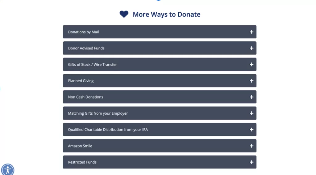
If you don’t have as many details to share, you can put accordion tabs at the bottom, as the Charles River Center’s donation page we designed does below:
Include the Impact of Donations
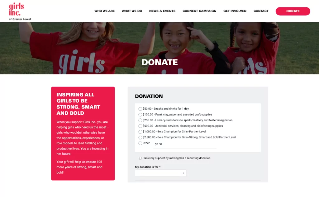
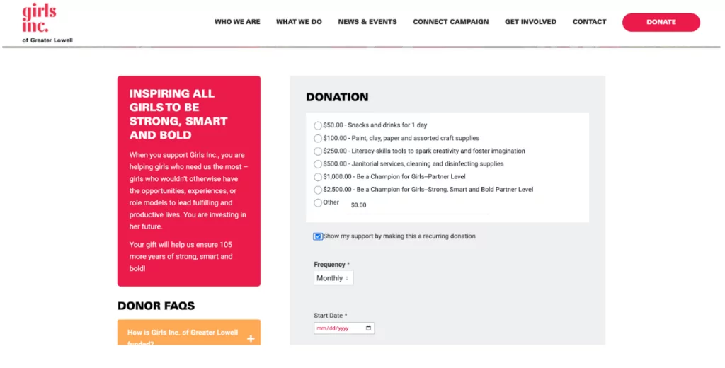
Tell your visitors where the donations will go, and how it’s helped by showing the direct impact. Girls Inc. of Greater Lowell’s donation page is an example of a donation page we designed, prompting specific donation amounts, and what they will be spent on:
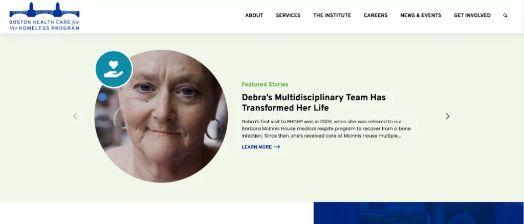
On BHCHP’s website, we featured success stories; using these stories to connect visitors, leading them to your donation page.
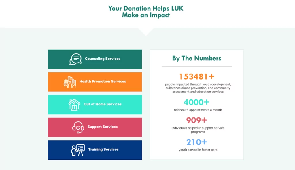
While on LUK Inc.’s donation page, we displayed impact through statistics. Visitors interested in donating want to know where their donation will go; 63% of donors want to know how their money will make a difference. Showing the impact your organization makes through other’s donations is very compelling.
Bring Attention to Your Donation Page
Put a CTA in Your Header
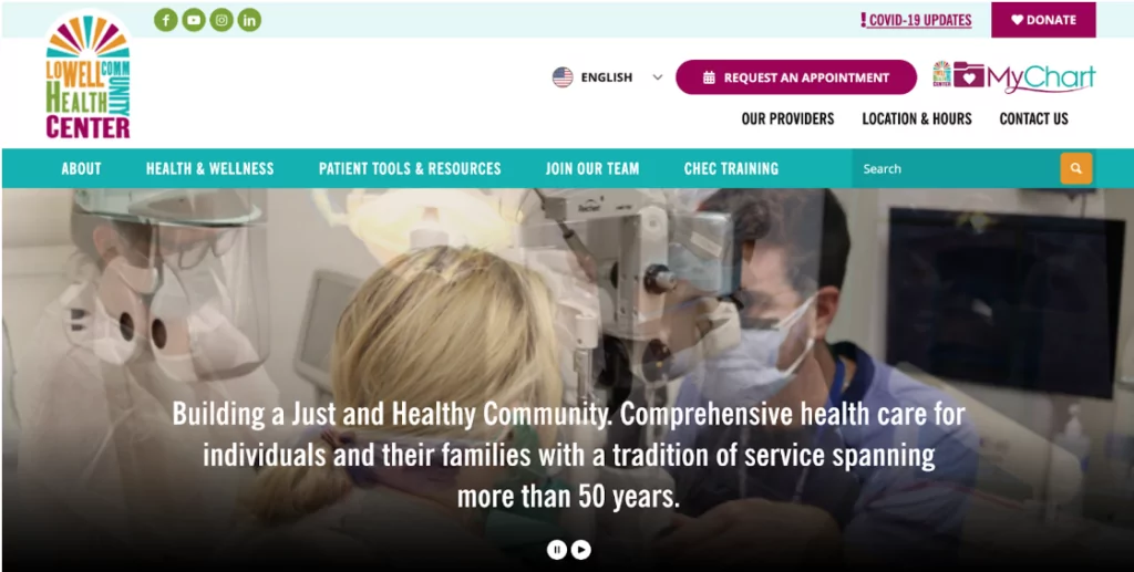
This donation page example is a no-brainer because of its simplicity. Include a CTA on your homepage to bring attention to your donation page. When designing the Lowell Community Health Center’s website, we added a CTA to the header with the word “Donate” to achieve this.
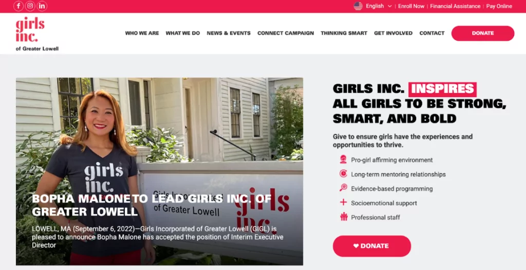
For Girls Inc’s website, we placed the “Donate” CTA in the header and in the body of the homepage for anyone’s eye to catch.
Add Pop-Ups
Adding a pop-up for when people enter your homepage is a missed opportunity to bring awareness to your donation page. Using a “Donate Monthly” pop-up can actually result in a 64% increase in monthly donations. Prompt visitors to become monthly subscribers or to donate as small as $5, directing them to your donation page.
Email Newsletter
Include an email signup form to collect subscribers. Visitors may not be ready to donate yet, but staying in touch with them could result in future donors or volunteers for your organization.
How to Collect Donations
Embed a Donation Form
Embedding a donation form directly on your website will make it easier for people to donate. This can be a custom form as we built for Charles River Center’s donation page:
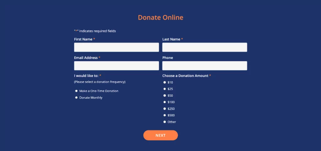
Or it can be an embedded form that’s easy to use. Similar to how we designed it on BHCHP’s nonprofit donation page below, including preset amounts for people to choose from.
Offer Subscriptions
It’s likely that you’ll have visitors that are really dedicated to helping your cause and want to donate regularly. 25.9% of the US population is millennials and 40% of Millennial donors are enrolled in a monthly giving program. Therefore, offer an option for monthly donations as we designed for Girls Inc.’s website, allowing people to pick a donation frequency.
Suggest a Variety of Payment Options
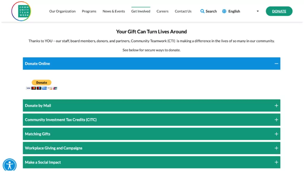
When it comes to donating online, it’s what people prefer, however, there’s a variety of ways to pay. From credit cards to PayPal to mail; everyone has a preference. For Community Teamwork below, we wanted to increase their chances of receiving donations by offering a variety of payment options based on the donator’s convenience.
Use Strong Branding
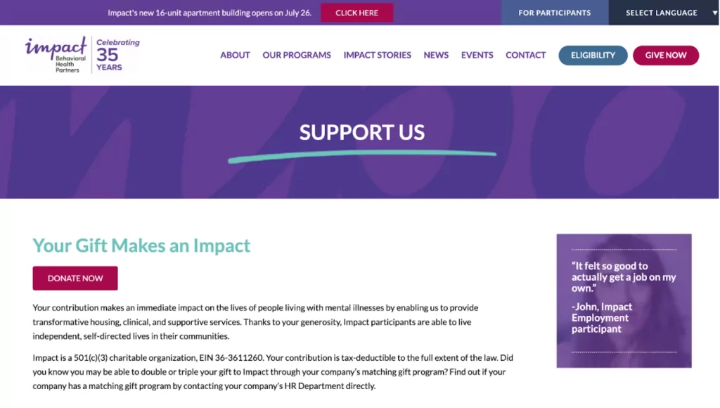
When people choose to donate online, they want to know that they can trust that the website is trustworthy and not a scam. Studies show that branded donation pages bring in 6x more money than generic donation pages. Making a website and donation page that have strong brand identities by matching the organization’s logo, font, and color scheme across the site will instill in visitors that they are donating to the right website. For example, the donation page we developed for Impact Behavioral Health Partners still utilizes their signature purple and the same font that’s used throughout the website. The header is still visible as well to let visitors know that they haven’t let the organization’s site.
Contact Us for Help!
If you’re not comfortable with updating or creating a website, it can be difficult to make some of these changes. Give us a call or email us because we’d love to design a non-profit page or a website that will help you reach your organization’s goals. If you’re looking for more examples of past work we’ve done with nonprofits, check out our portfolio of non-profit website designs for endless donation page ideas.