
When building a WordPress website, a business’s first instinct is to turn to their computer and view it from their desktop. But with over 4 billion people using the internet from their mobile devices, making your website mobile friendly is vital in order to turn website visitors into paying customers. The last problem you want is for your website on a mobile device to function incorrectly.
Learning how to make a WordPress site more mobile friendly doesn’t have to be difficult though. Fixing this problem can be as easy as using a mobile-friendly WordPress theme. If this is a problem you’re facing, we have some great tips to share with you. But if you don’t have the time, contact us, because we’d love to help you with your website hosting and maintenance.

Regularly Test if your WordPress if Mobile Responsive
Unsure if your website is mobile responsive to begin with? Clear up any confusion by running your website through Google’s Mobile-Friendly Test. It’s a convenient way to check if your website is mobile-responsive when making changes and updates to your existing site. This is a free resource that will allow you to test each page of your website for mobile responsiveness.
Mobile-Friendly Elements
Accordions and Drop-Down Menus
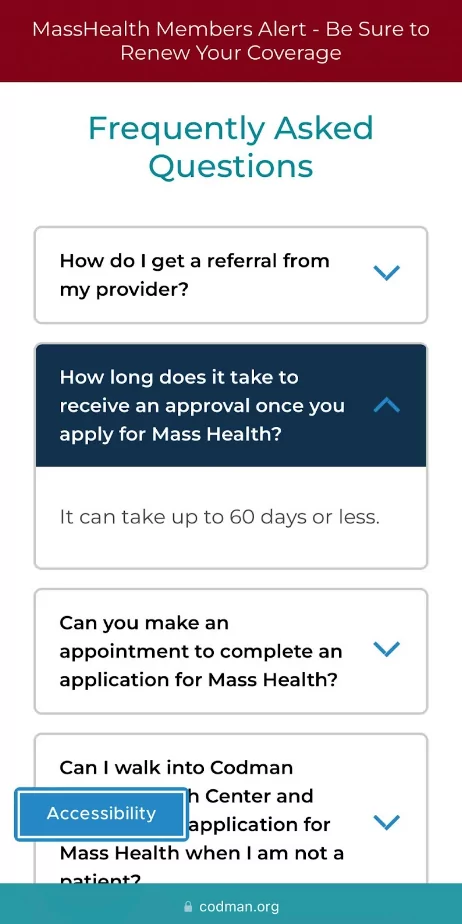
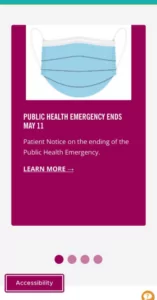
WordPress sites that aren’t mobile-friendly tend to have screens that are filled with text and no white space, which won’t make your website easier to read. But that doesn’t mean you should delete that informative content. Instead, utilize accordions and drop-down menus to minimize dense information for a mobile-responsive experience. You can do this by using accordion plugins on WordPress site, as seen below on the website we designed for Codman.
Tabs
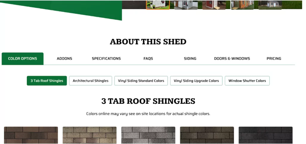
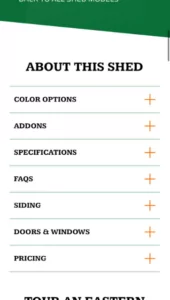
Tabs are similar to accordions, but they are horizontally aligned. They’re a great way to organize content on both desktop and mobile. Making sure tabs are mobile-friendly as well will help visitors focus on the content they want. They also offer a different appearance on mobile, but work like accordions for easy navigation. For example, with our work for Eastern Shed, we used tabs on one of their pages, but on mobile, they’ll appear as an accordion.
Scrolling Elements
On desktop, we’ll have elements in one row with four columns, but once you get to mobile, there are only two options. You can either stack all the elements and turn them into a carousel to rotate through content. Since stacking the elements causes the page to be longer, we recommend turning them into a carousel. For example, our client LCHealth has an element with four columns that turns into a carousel on mobile.
Use a Mobile Friendly WordPress Theme
The first place to step when making your WordPress site mobile responsive is the theme. Many WordPress sites are mobile-friendly, however, it’s possible that it’s not the case for your business. Consider implementing a mobile-friendly theme; this will make your website shift from one screen size to another seamlessly, without losing any of the function or design. You can also choose to create your own! Or, you can hire us to create your custom web design.
Looking to Redesign Your Website? Contact Us for a Quote
Get StartedAdjust the Pop-Ups on Your Website
No one appreciates a million pop-ups appearing on their screen when they’re trying to read an article or find the phone number of a business to contact. Pop-ups can be a great way to increase email subscribers, and that’s true on desktops. However, there are certain things you should look out for when using them on mobile because they are often hard to close out of and are difficult to view on smaller screens.
For instance, make sure they do not pop up immediately on mobile, but rather 30-45 seconds late so visitors can see your website first. It also should not reappear after being closed out. An alternative to pop-ups altogether is floating bars and slide-ins, which simply exist on the website rather than popping up.
Space Out Links to Make a WordPress Site Mobile Responsive
Using numerous links and limiting the space between them can make it difficult for people to accurately tap on the right link, in comparison to when someone is using a mouse on a desktop. By spacing out links, you’ll grant your visitors a better user experience because they won’t have difficulty using your website’s resources.

Having a Clean Header with Call to Actions
Robust Mobile Menus
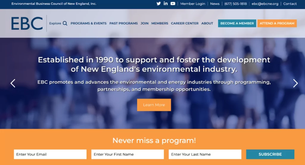
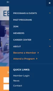
Headers often have many features such as a search bar, quick links, CTA buttons, and more. These can become difficult to showcase on mobile, therefore, having a robust mobile menu can resolve this. Organizing the mobile menu to include all of these items can provide the user with all the same features as the desktop website. For example, the website we built for EBCNE has a robust mobile menu that includes the same aspects of its desktop menu, as seen below.
Primary Call to Action in the Header
Many elements end up getting hidden on mobile, but the most important elements should still be featured in the top bar. When creating most of our client’s websites, we recommend a CTA in the header. If you’re not sure where to start, opt for including your company phone number and a CTA button in their header, it’s what we did for our client BostonbeaN Coffee Company.

Contact Us for Professional Help!
If you’re worried about the mobile responsiveness of your site, contact us! We can look at your site from both the eyes of a potential customer and a professional web developer. Call us at 617-539-6528 or click here to contact us!
